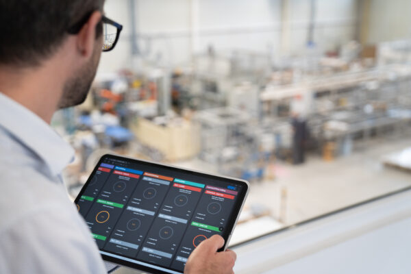
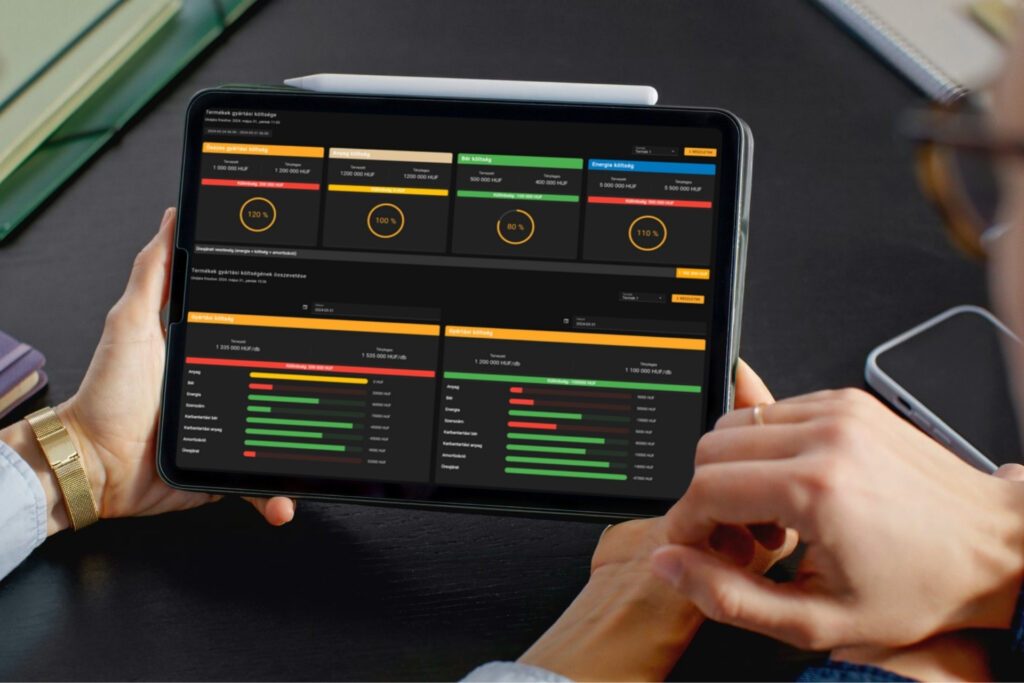
Perhaps it’s time to make friends with phrases like “in today’s fast-paced world”, “to serve specific needs”, “be flexible and customizable”… even if we’re in manufacturing? Why not admit that product development trends are now indicated by such demands and market players, if they want to keep their position, have to respond in some way. In the production digitalisation segment, customer needs are demanding newer and newer customisable functions from solution providers, without the need for special programming skills. In this article, you can read about our response to the current need for customisability.
Let’s start with an extraordinary simplification! The operation of an average IoT/IIoT system can be summarised in 4 main components:
- data collection,
- data storage,
- aggregation/business logic,
- service layer (user interface, notifications).
These software components interact with each other through different interfaces, pre-coded with defined reports and user interface elements. (This is true for the vast majority of softwares, for example, the applications running on our phones provide a fixed UI (user interface), where all functions are always in the same place and work in the same way.)
However, there are use cases where we want to display specific content to specific users in a particular menu item of the application. If, for example, a maintenance manager is promoted to the position of a factory manager, they probably would like to rearrange his favourite dashboard, which summarises the most important production data collected on a single screen. In such cases, the cutomer may contact the software vendor and ask for a re-implementation of the interfaces. Then they are confronted with how much time and money this takes, if it is possible at all… and that’s not what they were longing for!
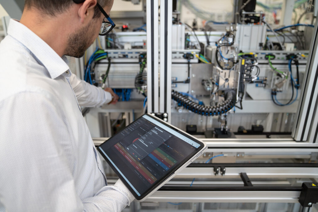
Introduction to self service systems
To satisfy such and similar demands, let’s first introduce a few associative terms: self-service business intelligence or self-service dashboard, or self-service reports. What does this mean exactly? It refers to the processes, tools and software that companies use
to select, filter, compare, visualise and analyse data independently, without the need for specialised and advanced IT training.
What do users expect from such a service?
- Information anytime, anywhere: users want to access reports when and where they need them. They need a platform that provides this kind of mobility and delivers information in different ways and formats.
- Fast reports: queries must run within seconds. No matter how much data is behind it, if an aggregation runs longer than 10 seconds on average, it is too long for users. So we need a platform that can serve the user interface with data in seconds.
- Customizability: customizing your own dashboards is critical for efficiency and user adaptation. The solution must be intuitive so that users can learn things that would otherwise require consultants, developers and valuable time/money. This simplicity and customisability is also critical for user adoption, because if a user cannot tailor a dashboard to their own needs, they are easily frustrated and move on.
For our approach the term self-service dashboard fits best. We will refer to it as SSDB (self-service dashboard).
Customizable SSDB, an IIoT dashboard according to end users’ needs
Our latest generation WaMeWo IIoT platform has been described in several previous articles. We are able to extract data from a variety of machine controllers (robot, PLC, CNC, etc.) through different inferfaces, from which we create so-called observations one layer up. These observations are raw or aggregated data such as temperatures, part counts, motor currents or even daily/weekly/monthly OEE values.
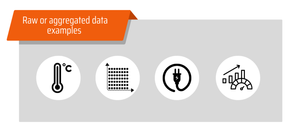
Our system is able to stream or even store in near real-time the changing values of the observations in the database (and even combine observations, but that could be the subject of another chapter…). These observations serve the user interface components with data: tables, graphs, reports, etc. It is also worth noting here that the web application running on top of WaMeWo uses a component-based framework whereby each of the main components (e.g. stamp images, charts, tables) can be universally reused and customised by parameterisation.
So what can we cook with?
We have a huge data set, whose endpoints are easily accessible, and a set of components from which we can select and reuse visual elements at will. Why not create a menu item where the end user can connect the two themselves?

Although the – necessary – complexity of our WaMeWo architecture could be described at length, we have kept it simple when developing the self-service dashboard. As this functionality is actually in the hands of our end users, who are mostly not software developers, intuitive usability is of key importance. This means that with a few clicks and simple steps we can create our own cards and then turn them into custom displays.
How can I create my own WaMeWo dashboard?
We’d love to go into detail on how to build a customized self-service dashboard, but given that the process is as simple as a few steps, this chapter won’t be too long… and that was our goal! An intuitive wizard guides the user all the way through, you can’t go wrong with any step.
Basically, the dashboard is made up of 4 main components that can be combined in a variety of ways, widening the range of possibilities.
- header: you can fill the header of each card you create with any content you like
- content: the content added to the cards you add essentially represents the data endpoint that you want to visualise in some way. From the list generated by the names of the available metrics (e.g. “Availability” or “Current OEE”), we only need to select the one we need. The selected content can be displayed on a chart, progress bar, in text format (one or more values), etc.
- divider: it is possible to add dividing lines to our cards if we want to separate information on a card
- card: you can add an additional card to an existing card, so you can even map a group of cards.
What other customizations can be made to a card?
- resize, drag and drop cards and their contents as you like
- colouring the headers of cards as you like (even dynamically, e.g. by machine state)
- icon selection in header
- choice of text colours
- set font sizes (S/M/L) and formatting (bold, italic, etc.)
- sizing of charts (S/M/L)
- multiple chart types: timeline, line, bar (horizontal/vertical) or pie chart
- full dashboard access in both dark and light theme (we prefer dark mode for environmental reasons)
- also full-screen display of real-time or hystorical data, or of course a mixture of both
The result
What you can get out of the self-service dashboard in WaMeWo is limited by only three factors: the available card views, the data the system collects and – your imagination.
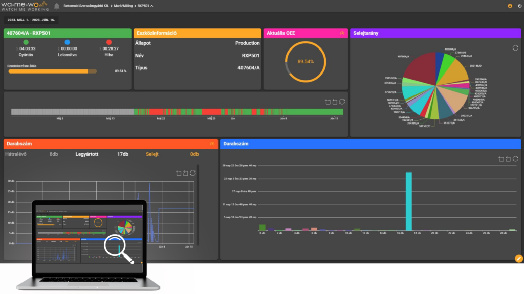
For demonstration purposes, we have put together a random example (see below) that is designed to deliver valuable information to end users at a cognitive level (by glancing at it) by displaying the following data:
- the current operating status of the machine(s), availability for the shift, distribution of different operating statuses
- visualisation of machine states during the shift (time line)
- current (calculated for the shift) OEE value, visualised by a progress circle
- distribution of scrap quantities by different product types (pie chart)
- display of the quantity produced, remaining and scrap, hystorical visualisation on a line graph
- visualisation of the pieces produced by production time, using bar charts
Take aways
Just as there is no universal production process, there is no universal dashboard of production monitoring indicators. We believe in customisation and that production efficiency of factories can best be tested on the basis of individual indicators. A self-service dashboard for a production monitoring system provides an almost infinite combination of possible uses, but it is essential that the platform can compensate for this infinite variance with the simplest possible functionality!
Whatever the level of production monitoring system, consider the following two basic requirements for dashboards:
- KEEP IT SIMPLE! Even if the platform is technically capable of it, we recommend that no one wants to summarize the entire production with an almost infinite amount of granular information! With too many components, you won’t see the forest for the trees, and your dashboard will lose its ability to provide lightning-fast information.
- USE DATA VISUALIZATION! Since the human brain is the fastest at visual perception and interpretation, it makes sense to use as many graphical elements as possible – as opposed to text and numerical data.
What is this series of articles about?
This series of articles has been compiled by our team in order to provide both technological and business know-how for professionals involved in the digitalisation of the industrial sector. The chapters follow two guiding principles:
- exploring the reasons behind the manufacturing digitisation software technologies used and
- demonstrating their potential for business use.
We trust that our content will provoke constructive professional discourse. We welcome your feedback, opinions or questions on info@indeveyes.com-on or our social media platforms!
- In a previous article in this series, we wrote about Quality monitoring in manufacturing – with IIoT tools
